A table tells you where three technologies end up. A curve tells you how they got there — and in a twenty-five-year asset, the route matters almost as much as the destination. That is the argument of this slide, which plots the same three cell architectures across the full warranty horizon rather than at its endpoint.
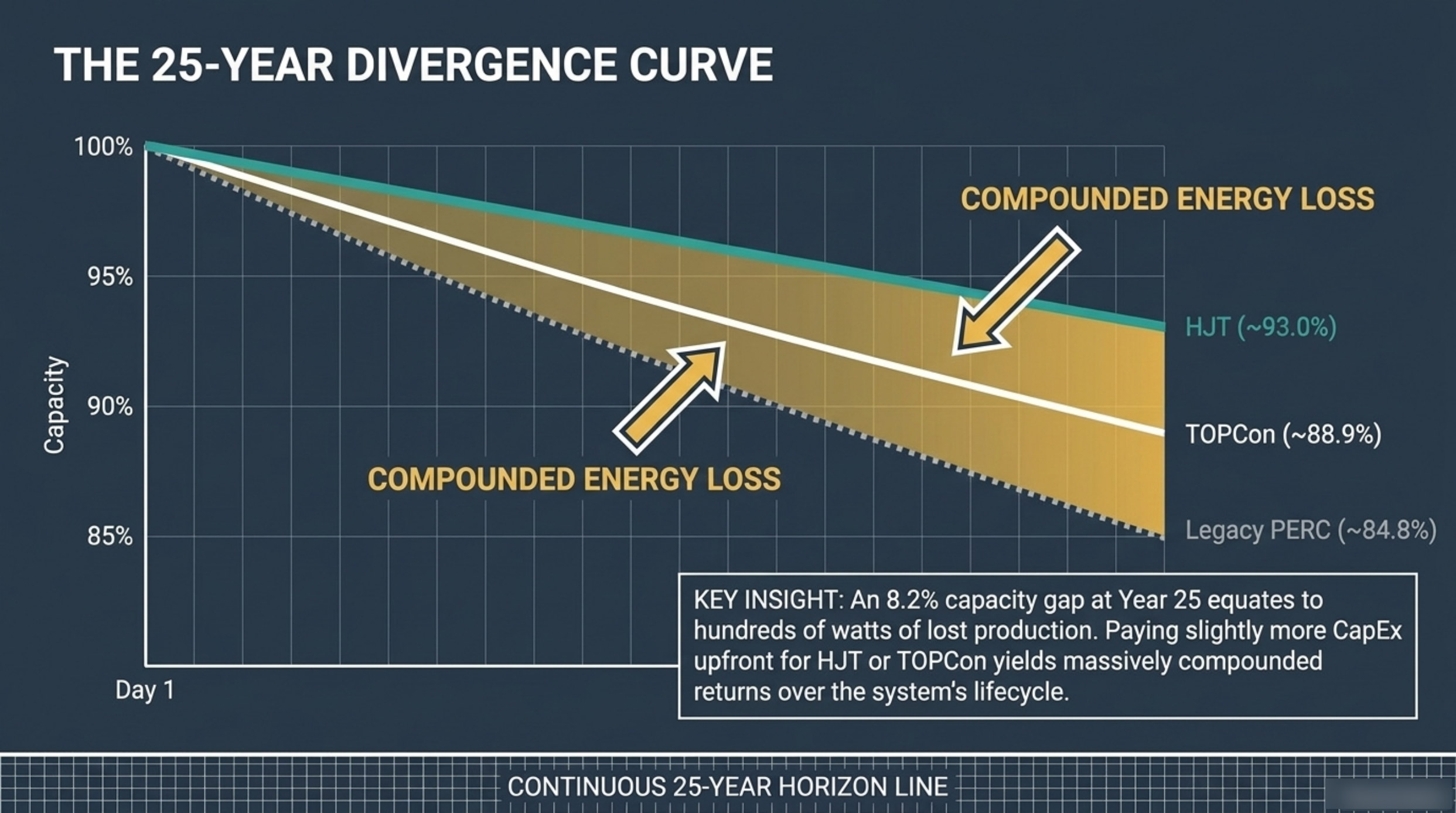
The 25-year divergence curve runs capacity from 100% down to 85% on the vertical axis and time from day one to year twenty-five on the horizontal. Three lines fall away from a common starting point: heterojunction, TOPCon and legacy PERC. All three begin at full capacity. By year twenty-five they are separated by a gap the deck puts at 8.2 percentage points.
A curve says something a table cannot
The retention matrix on the previous slide gives three year-25 figures side by side. Useful, but static. The curve adds two things a table cannot show: the common starting point, and the shape of the fall between the endpoints. Because all three architectures begin at full capacity, every point after day one is a measure of divergence rather than of absolute performance.
That reframing matters when a homeowner is choosing between two quotes. The question stops being which module is better and becomes how much the trajectories separate, and when. The answer is: slowly at first, and then not.
Day 1: the lines start together
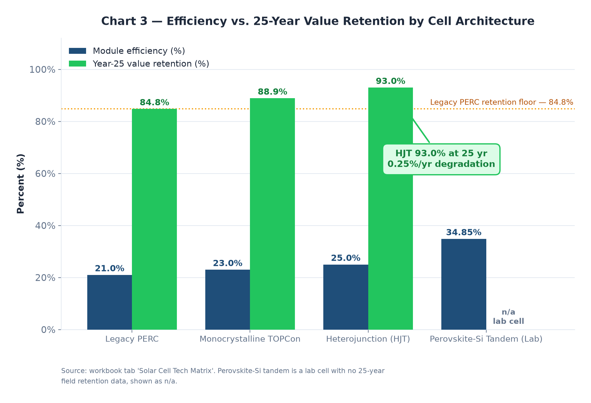
On the horizontal axis, the curve begins at day one with all three architectures at the top of the scale. This is the point the deck's table described as first-year loss, and it is where the first separation appears. Legacy PERC gives up 2.0% in its first year, TOPCon 1.5% and heterojunction 1.0%.
Half a point does not sound like much at the start of a twenty-five-year line, and it is not. That is the point of drawing the curve. The early years are the least informative part of the chart, which is exactly why a day-one efficiency comparison feels so reassuringly close — and why it is the wrong place to stop looking.
The divergence is slow, then it is not
Annual degradation is applied to whatever output remains, so the gap between two lines widens by a slightly larger absolute amount each year. A 0.55% annual rate against a 0.25% annual rate is a 0.30 point difference in year one and a much larger cumulative difference by year twenty-five, because each year's loss is calculated on a base that the previous years have already reduced.
By the time the curve reaches its right-hand edge, the three lines have fanned out across the middle of the chart. Heterojunction is holding around 93.0% capacity, TOPCon around 88.9% and legacy PERC around 84.8%. The deck's key insight names the consequence directly: an 8.2% capacity gap at year twenty-five equates to hundreds of watts of lost production.
What 8.2 points is worth in watts
Converting that gap into hardware makes it concrete. Against the 6,300 watt baseline used throughout this teardown, 93.0% retention leaves roughly 5,859 watts of capacity; 88.9% leaves about 5,601 watts; 84.8% leaves about 5,342 watts.
| Architecture | Year-25 retention | Capacity at year 25 | Gap vs. HJT |
|---|---|---|---|
| Heterojunction (HJT) | 93.0% | ~5,859 W | — |
| TOPCon | 88.9% | ~5,601 W | −258 W |
| Legacy PERC | 84.8% | ~5,342 W | −517 W |
The 8.2 percentage point spread between the top and bottom lines is 517 watts of capacity still present or already gone in year twenty-five. The narrower 4.1 point spread between TOPCon and PERC is 258 watts. Put another way: choosing the bottom line is roughly equivalent to removing one modern panel from an array that was installed a quarter of a century earlier, and continuing to live with that decision every day until the array is retired.
What makes the gap more than an accounting curiosity is that it arrives at the end of the horizon, on hardware that has been paid off for a decade. The electricity produced in year twenty-five carries no capital servicing cost at all, so the marginal value of every watt still flowing is at its highest. Losing hundreds of them at that point is not the same as losing them on day one. The full comparison of the three architectures on efficiency, coefficient and degradation sits in our article on the technology retention matrix, and the value framing in TOPCon vs. HJT vs. PERC.
Why slightly more CapEx upfront can be the cheaper decision
The deck's conclusion on this slide is blunt: paying slightly more capital upfront for heterojunction or TOPCon yields massively compounded returns over the system's lifecycle. The word doing the work is compounded. The premium is paid once, at day one, on a capital cost that is already reduced by the 30% federal credit. The benefit accrues every year for a quarter of a century, on a base that grows rather than shrinks.
This is why the curve belongs in the capital-cost decision rather than beside it. A $16,129 baseline array whose modules hold 84.8% at year twenty-five and one whose modules hold 93.0% may cost a few hundred dollars apart at purchase. The divergence chart is the reason that gap is worth paying, and the reason a day-one price comparison that ignores the trajectory is comparing the wrong things. For how the two sides of the ledger combine into a single return, see the 25-year total cost of ownership teardown.
Call (928) 698-6192 for free, no-obligation quotes from pre-vetted Flagstaff solar professionals.
Frequently asked questions
What does an 8.2% capacity gap mean in real terms?
On the 6,300 watt baseline array used across this teardown, 8.2 percentage points of year-25 retention is about 517 watts of capacity. It is the difference between a system still producing roughly 5,859 watts in year twenty-five and one producing roughly 5,342 — on hardware that has been fully amortised for years.
Is a compounded loss the same as an annual loss multiplied by 25?
No. Annual degradation is applied to the output that remains, so each year's loss is taken from a slightly smaller base. That is why the curve widens gradually rather than following a straight line, and why small differences in the annual rate produce a much larger spread by year twenty-five than they appear to at the start.
How much more does it cost to move up to HJT or TOPCon?
The deck characterises it as paying slightly more capital expenditure upfront rather than quoting a fixed premium, and the relevant comparison is against the value of the retained capacity. On a 6,300 watt array the year-25 difference is around 517 watts versus legacy PERC, arriving on a system whose capital costs have already been recovered.